IS 308 Visualizations
Visualization 1: Representation Test Scores of Each Decade
This interactive bar chart and line graph pair displays the mean test score of a test similar to a Bechdel Test we did on our data set. Our dataset contains 3 yes/no questions: “Is there an asian character in this film?,” “Does this asian character have a speaking role?,” and “Is the asian representation in this film depicted as foreign or subjected to alienation?” In order to pass the test that we created, the answers to these 3 questions must be as follows: Yes, Yes, No.
The bar chart on the left shows the average score of films from each decade. We can tell that the films who pass this representation test the most are from the decades 1990, 2010, and 2020. We can draw the inference that these are years where asian representation was high and doing very well in terms giving an authentic representation of asian Americans to an American audience. If wanting to interactive with this graph more, you are able to click each individual decade of the bar chart to view the timeline of test scores on the right line graph.
Visualization 2: Distribution of cultures in Films that non-alienates
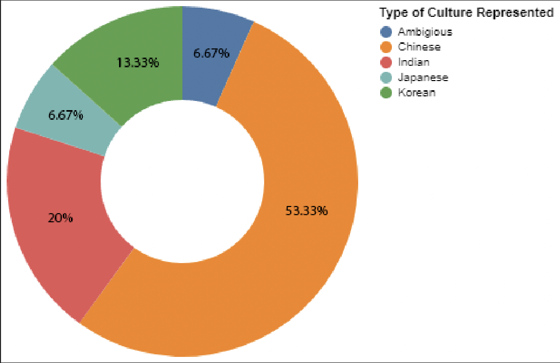
The pie chart above displays the percentages of the types of culture represented in our dataset given that asian culture is depicted as foreign, alienated, or “other.” 53.33%, a little more than half, of the chart is dominated by Chinese American representation in films. This means that within these top, impactful asian American films where asian culture is depicted as something negative and different, most of the films suffering from it are of Chinese representation. This significant percentage is followed by foreign Indian representation, foreign Korean representation, Japanese, then ambiguous. In conclusion, Chinese people in Asian American films are often depicted as foreign, alienated, or “other,” but other asian races often suffer from the poor representation as well.
Visualization 3: Audience and Critics Scores of Best Performing Films in each decade with context
The grouped bar chart above displays the average audience scores and critics’ scores of movies from each decade. Both audience and critic scores were based on percentage ratings. There is no true discern-able pattern through our chart. However, critic scores tend to average higher than audience scores in every decade. The 1990s is an outlier due to the movie Mulan, released in 1998, having no public critic scores at all. In the 2000s, all 5 movies we took data from averaged out evenly, which tells us that asian representation in movies was doing very well in the 2000s. All scores were consistently high